August's popular simple device installation changed how we look at conventional methods of reading manual books.

Background
With every launch of new product, August needed to create new installation guides, and each one is specific to their own device. Prior to introducing our 3rd generation hardware devices, we noticed around 80% of our users had difficulties with our installation guide.
Role
I collaborated with product managers, customer support, engineering and marketing to create product planning, ideation, and build the guide. I, along with another designer built this comprehensive guide, research, and ideation. I also led the asset production and program management.
Involvement
User Research
Persona/Scenario
Wireframing
Prototyping
Asset Production
Sketch
Zeplin
Constraints
2 months work
Limited resources
Limited bandwith
Cost minded operation
Mini note: In August's entire app experience, a user spends the longest time interacting with the app during setup and installation. August's main purpose of the app is to use less of it if possible and remove the tech friction by offering acessories and solutions such as Apple Watch feature, and widgets for iOS and Android for faster control. This is the reason why August invested so much resources and thought into the onboarding process for these devices.
Problems
Low discoverability of printed materials
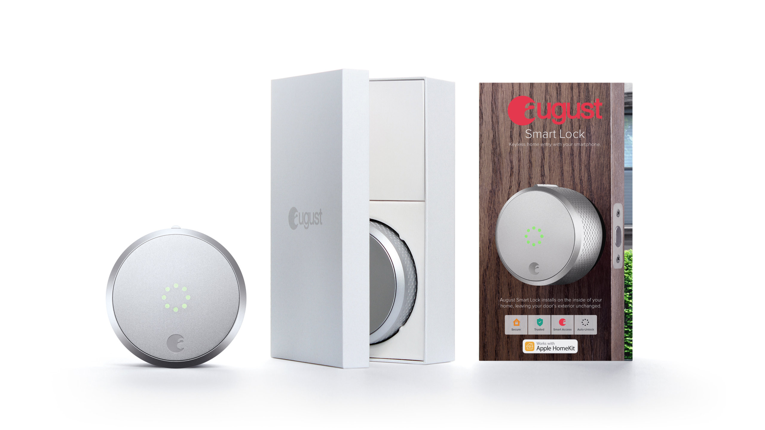
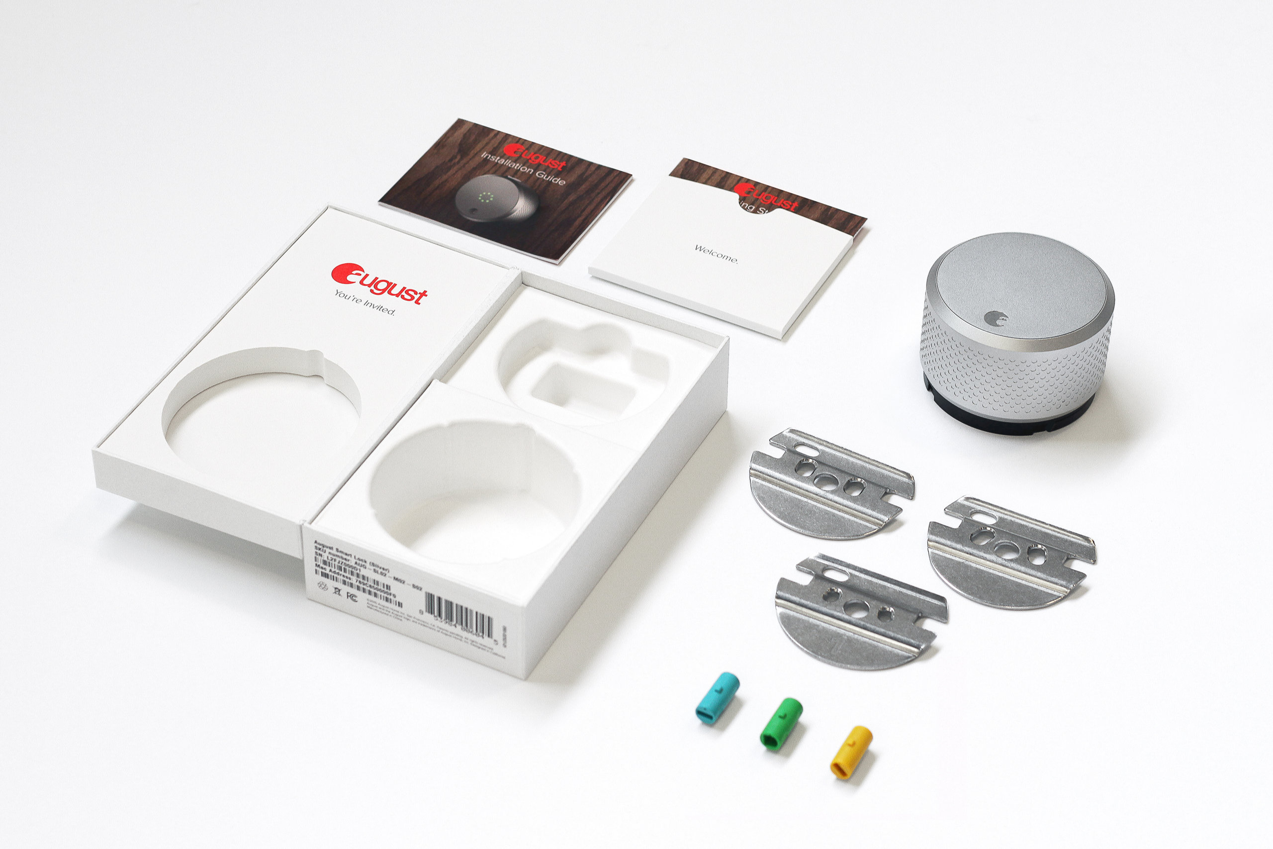
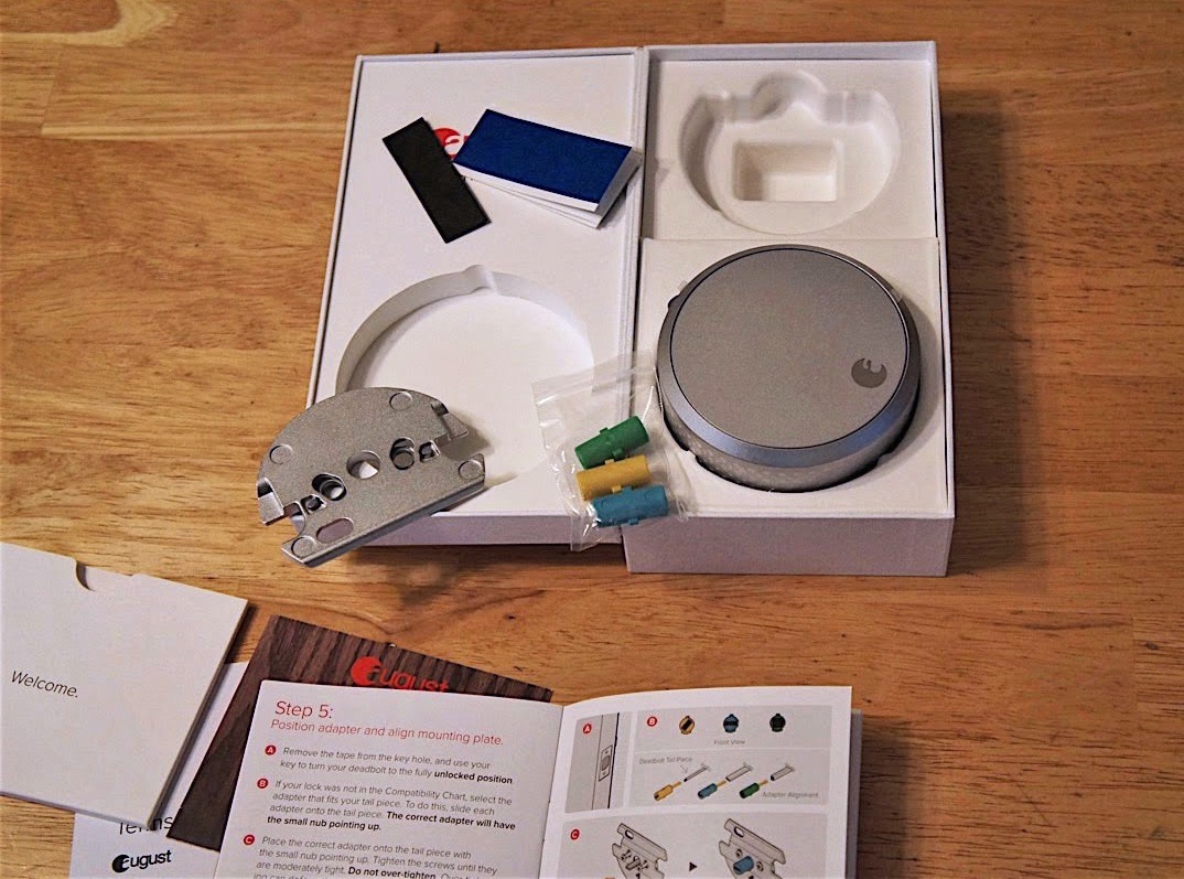
The installation guide was hidden inside an envelope within the packaging, making it easy to miss. It also assumed users would proactively read printed instructions before setup
Ineffective communication through static content
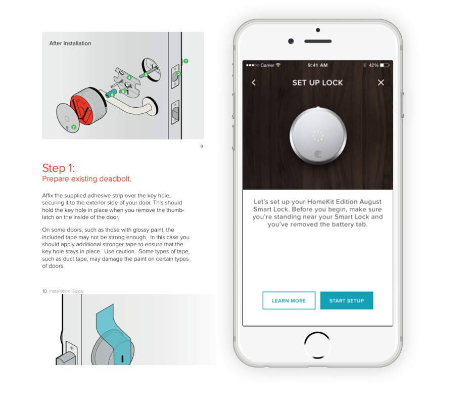
The printed guide relied heavily on illustrations and dense text, which didn’t translate complex steps clearly. The mobile app made no reference to the manual, leaving users unprepared.
Disrupted user flow
The app assumed the lock had already been installed, introducing friction for users who hadn’t yet completed the hardware setup.
Lack of personalized guidance for varied setups
Each household has different needs — deadbolt types, wall materials, and optional components like DoorSense. A one-size-fits-all guide failed to address these unique installation requirements.
Goals
Business Goal
Introduce 3 new devices while still maintaining our reputation in simplicity and security and at the same time lower company costs.
UX Goal
Provide a simple way to illustrate complex information without breaking user flow for setup
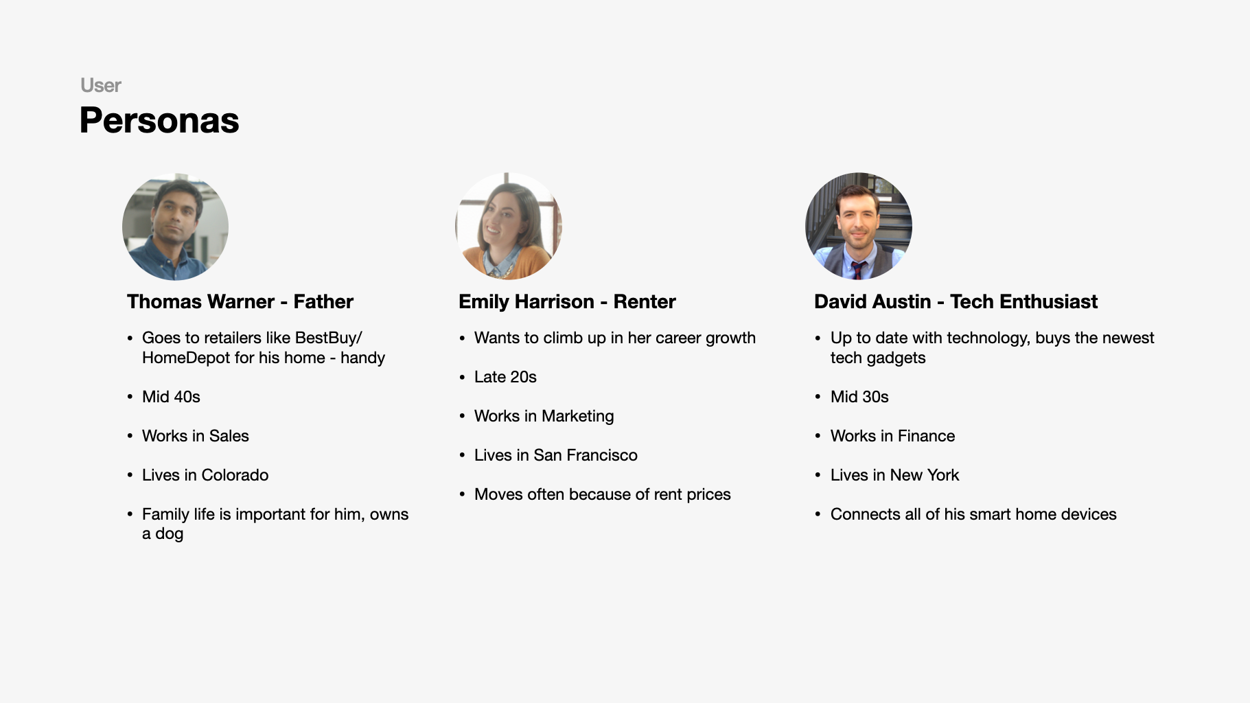
August Users
To guide design decisions, three personas were selected to reflect this diversity — from tech-savvy early adopters to cautious first-time users. Each brings different expectations, levels of confidence, and motivations when interacting with the installation experience. These personas helped uncover how frequently a user might reference the guide, what kind of guidance they expect, and how intuitive the experience feels based on their background.
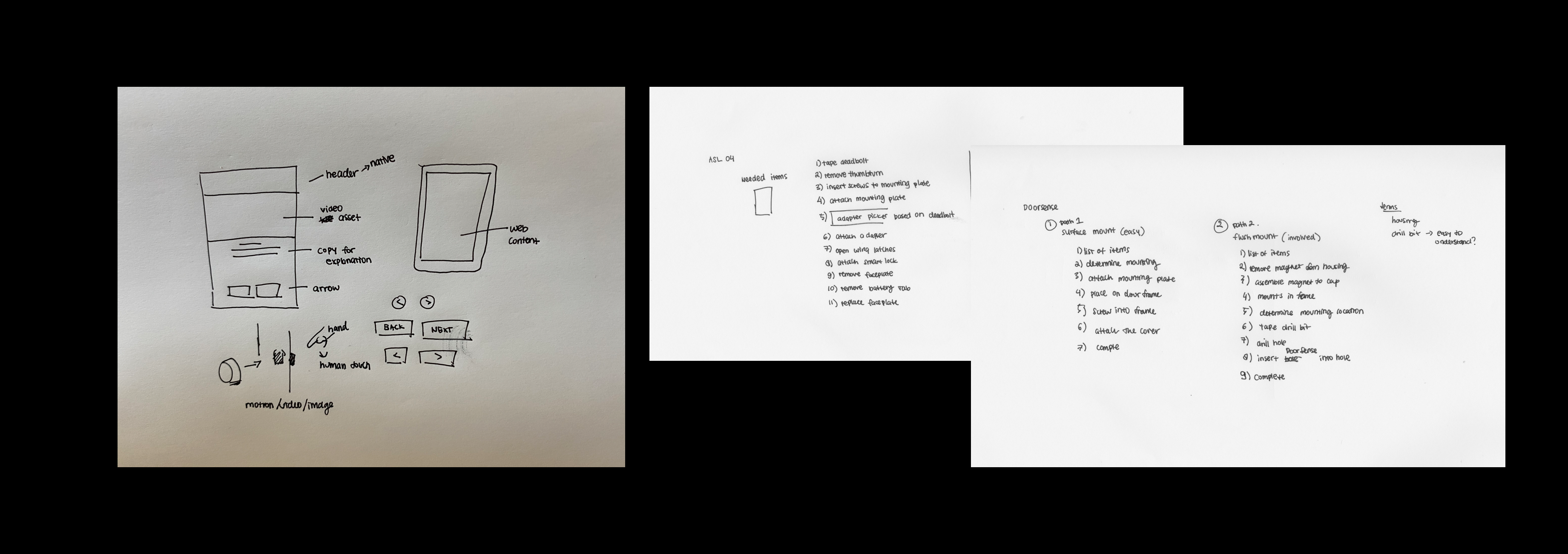
Sketches and Planning
To support users unfamiliar with door hardware, the installation experience was redesigned in collaboration with the Customer Support team. The goal was to reduce friction for first-time installers and remove the intimidation often felt when interacting with a deadbolt lock.
Step-by-step instructions, originally printed and tucked into the packaging, were brought into the app and seamlessly integrated into the onboarding flow. Static illustrations were replaced with instructional videos, making the guidance more intuitive and accessible. By making the flow interactive, users could tailor the experience to match their specific setup — selecting door types, deadbolt styles, and optional components like DoorSense — and receive the right instructions for their configuration.
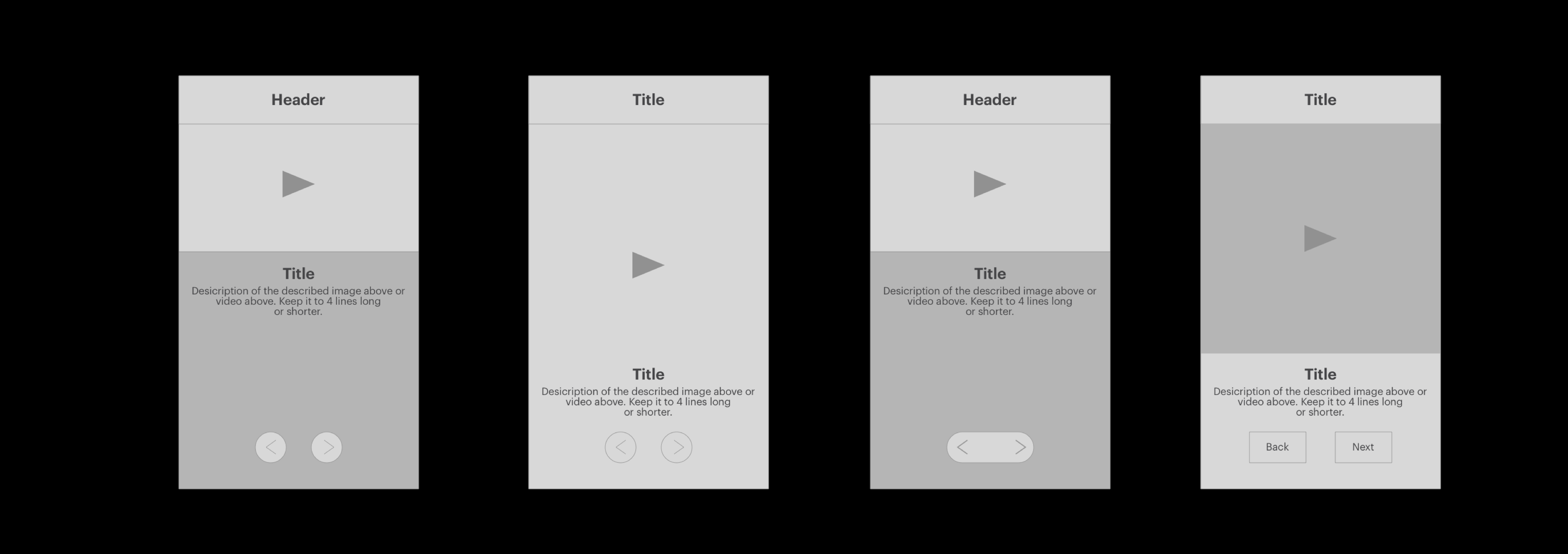
Design and Direction
The installation flow was designed using August’s existing app components to stay consistent with the broader onboarding experience. Each step featured helpful visuals paired with concise instructional copy, making it easier for users to follow along without feeling overwhelmed. A progress indicator and step-by-step navigation gave users more control — a clear improvement over the typical scrub-to-pause video approach used by competitors.
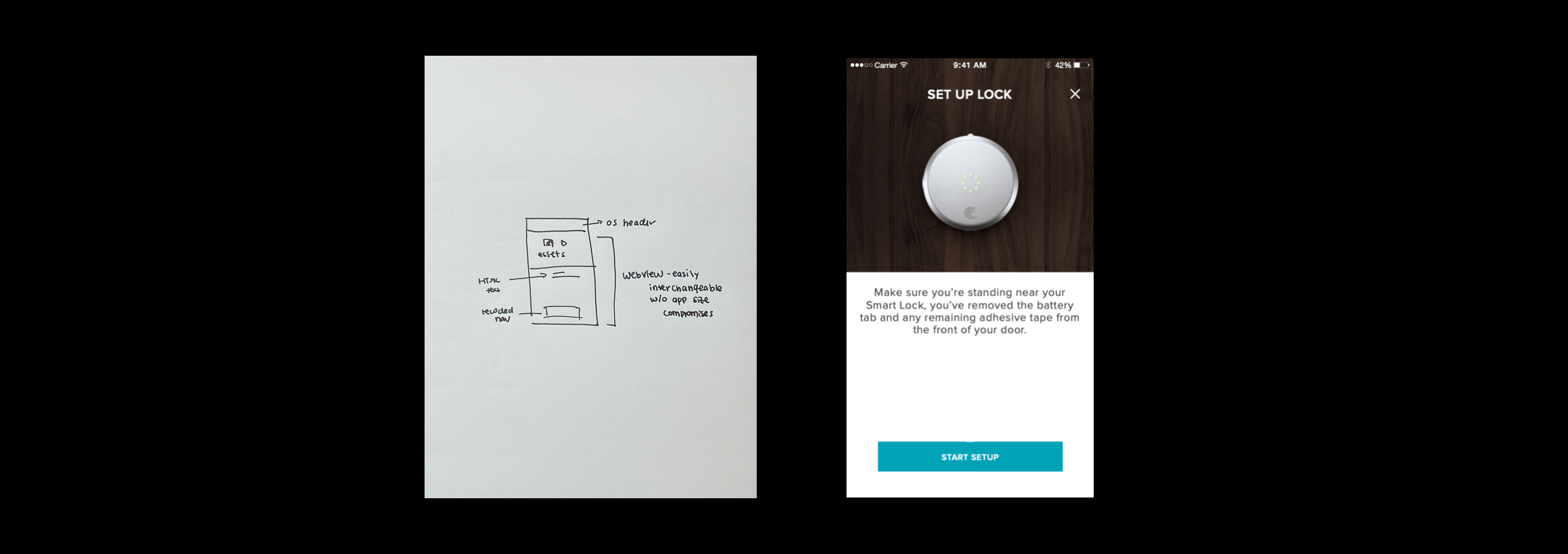
To keep the app lightweight and flexible, the entire setup was delivered via webview. This approach followed platform best practices, reduced the app’s footprint on users’ devices, and allowed instructional content to be updated without requiring a full app release.
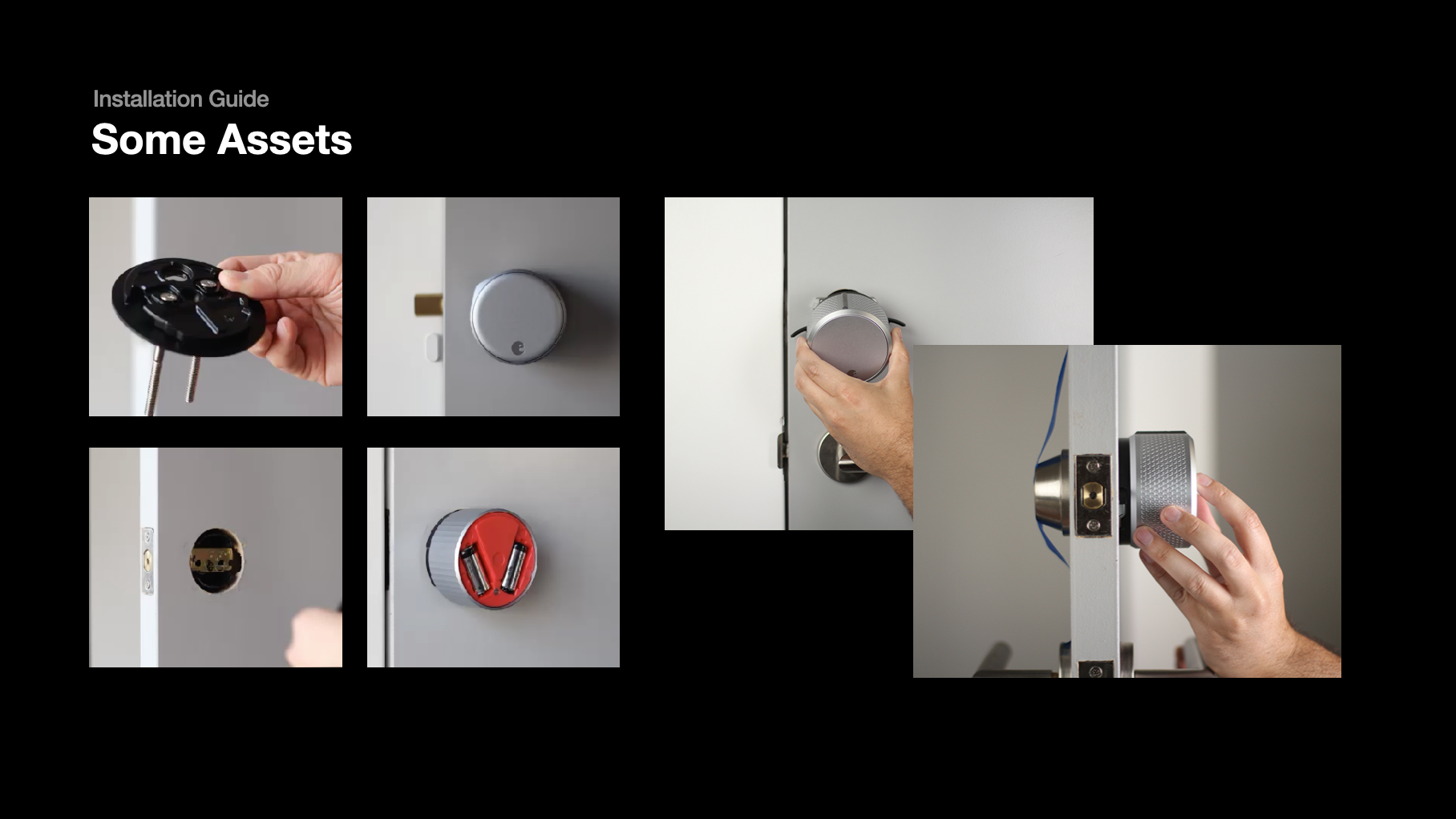
Video and image content featured real people instead of motion graphics, bringing a more human and approachable feel to the experience. This approach also allowed for faster production, lower costs, and easier reuse across support articles — helping users feel supported at every step of the way.
Production
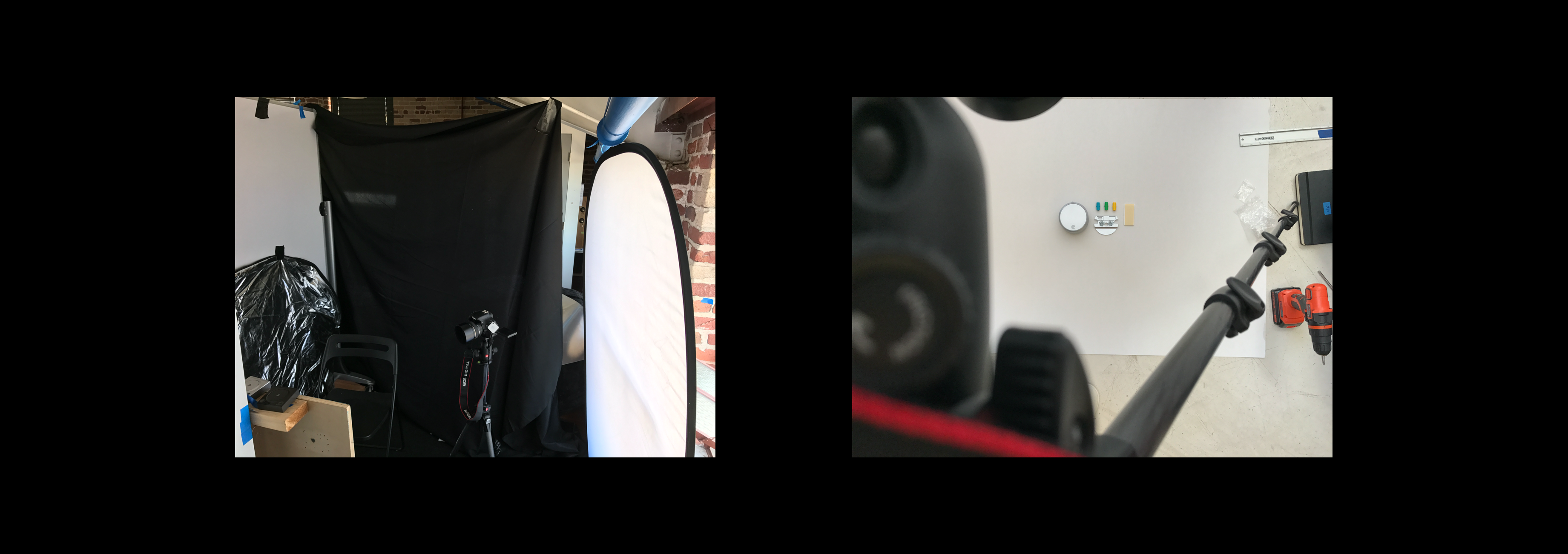
The work was split between my co-designer and me: he developed and implemented the webview components to match our designs, while I produced the visual assets. The shoot spanned 1.5 weeks, covering 7 device types and 146 shots, including revisions. Each shot was carefully planned to highlight key installation moments from the most helpful angles. I also coordinated asset delivery and worked closely with our editor to ensure clarity across all steps. Additionally, my co-designer contributed icon sets for the deadbolt adapter picker.
Why
1. Eliminated discoverability issues by fusing it in the setup flow. Users do not need to scout for the installation guide in the packaging.
2. Interactive videos made it easier to follow through at user's pace, removing the need to scrub videos and IA issues. This saves the user's time from reading long text heavy manuals.
3. Modular design made it easier to update on August's end.
4. Less cost, we built all of this in house without much spending.
5. Didn't affect app size because of web view.
Validation
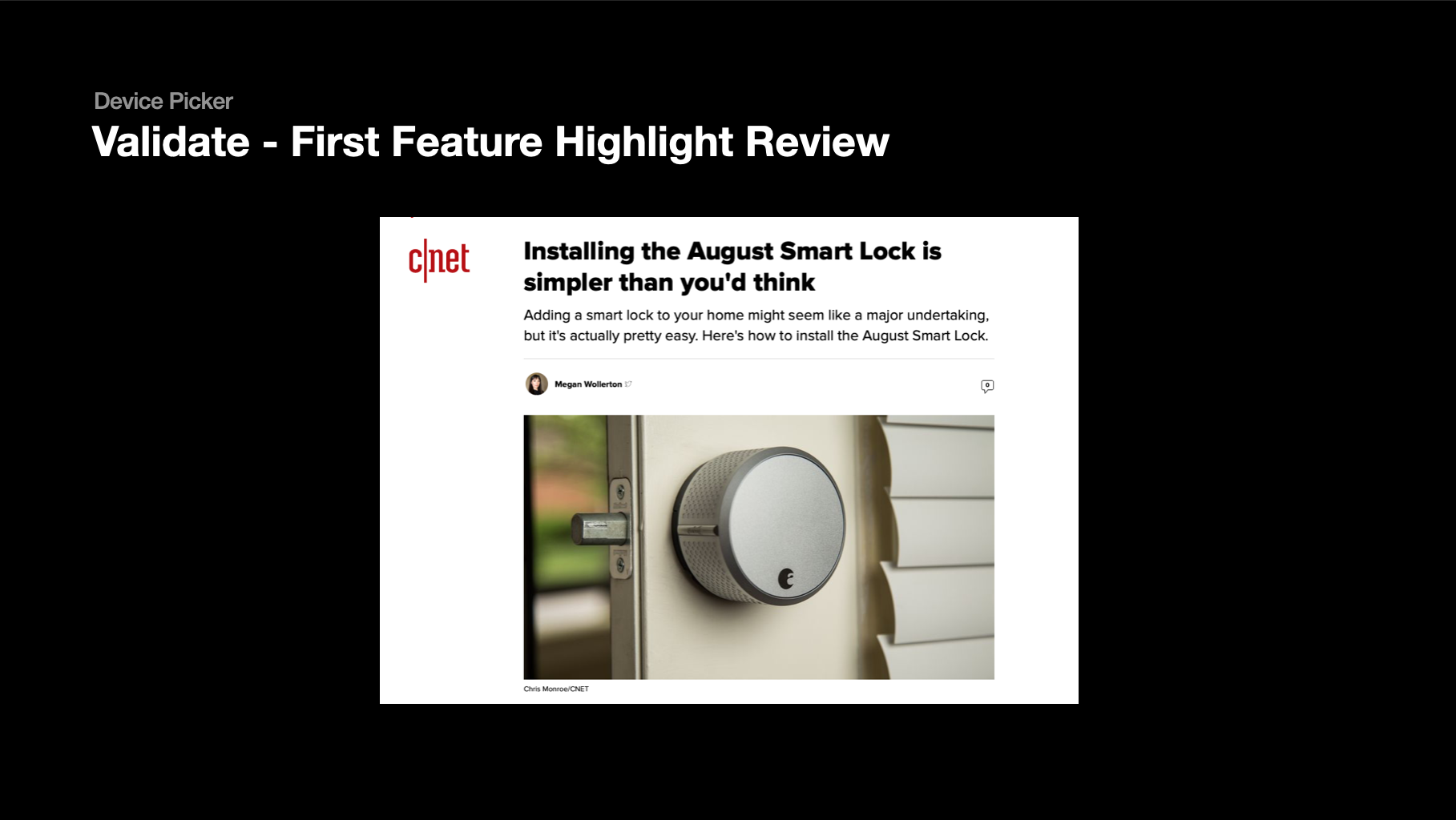
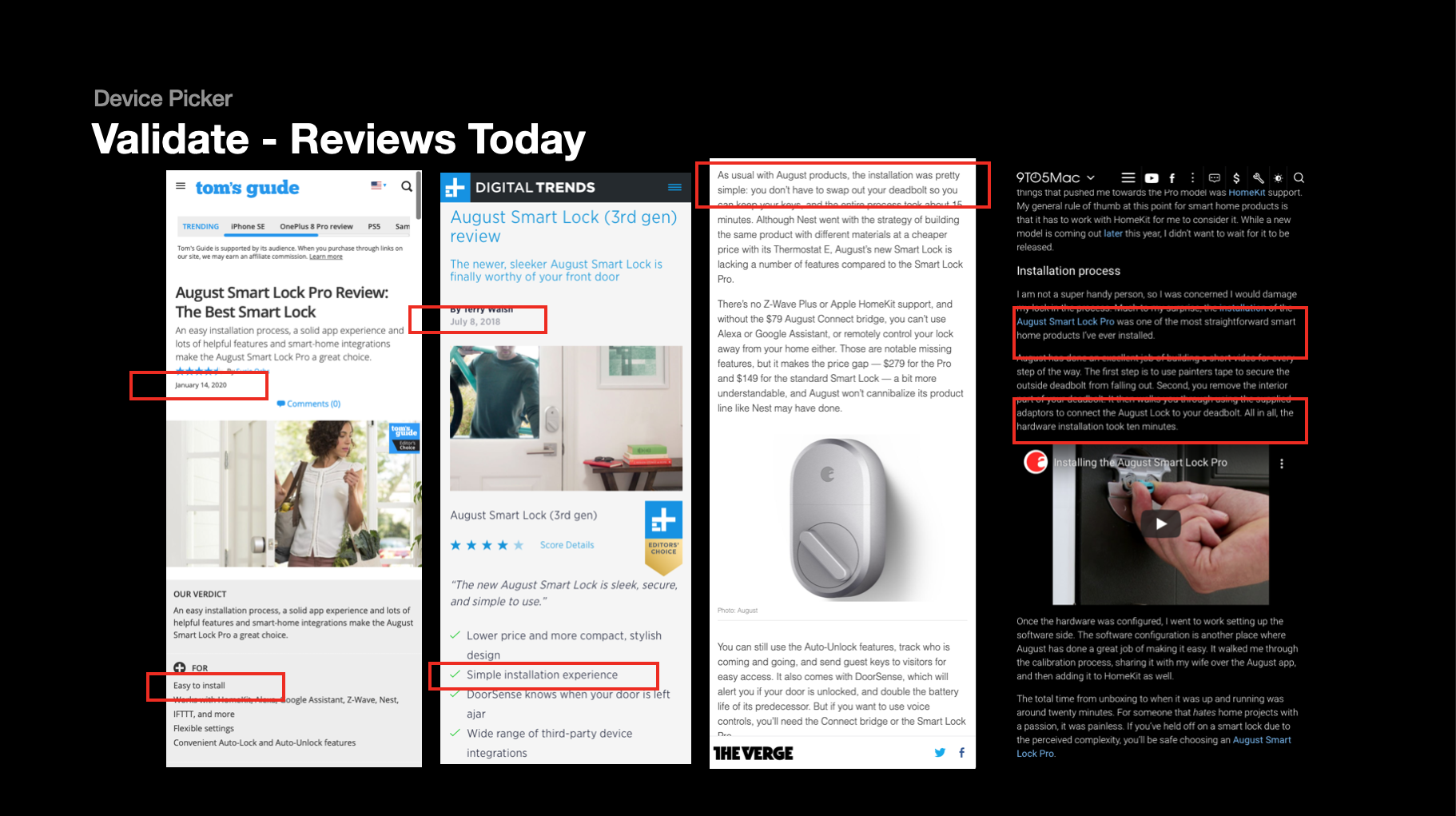
1. One of our most popular selling feature is the ease of installation
2. Tested internally by sharing our prototype and made rapid changes. Shared it to our product, CS, and executive team.
3. After launch, I decreased 87% of incoming support tickets regarding installation
2. Competitors started to follow our lead on this feature soon after
Full Case Study
For a full case study version of this project, feel free to reach out!
Reflections
If time and resources had allowed, motion graphics would have been a compelling alternative. They’re more reusable and require less logistical coordination than live-action shoots, which involved setting up a studio space in the office.
One key takeaway was realizing that not everything needed to be hardcoded into the app. Using webviews helped solve challenges around modularity, scalability, and information architecture — especially as different customers required slightly different instructions.
This project also deepened my understanding of user empathy. Many users weren’t familiar with the mechanics of deadbolts, DoorSense, or even smart doorbells. Guiding them step-by-step — in a clear, approachable way — was critical to the experience and ultimately, to the product’s success.
Contact
hello@kevinlessy.com
Kevin Lessy | 2025
Designed with 🩷 and ☕️