August's international expansion requires us to rethink our device setup with a design that will be universally compatible across multiple brands.
The new August Wi-Fi Smart Lock is now equipped with built in Wi-Fi, requiring no bridge to connect. All in a smaller housing by 45% volume reduction and 20% slimmer profile.
Overview
Alongside the launch of August Wi-Fi Smart Lock, the August app needs a revamp on the way it sets up devices. The app was optimized to support August's small line of hardware lines, and it is expected to be able to set up multiple locks from other brands as part of global expansion. The convoluted Information Architecture will affect its user experience.
Role
As the UX Lead, I led the research and gathered information on demands from stakeholders. I was in charge of the product design on both iOS and Android versions, built wireframes, IA maps and high fidelity mock ups by working closely with the engineering and product team.
Overview
As the lead User Experience Designer for the August Wi-Fi Smart Lock, my involvement with this project focuses on building a simple and easy to understand experience from the moment you unbox the device to after care. That includes the following:
• Device Setup
• Device Installation
• Device Behaviors
• Device Settings
• Asset Production
• In-App Messaging
• Product Planning
On paper, this may not sound like a lot of changes for a company to just add Wi-Fi chip to a new device and make them smaller on the hardware side. However, as you will see here, there are a lot of work goes into the software side as well, and how the marriage of hardware and software plays a critical role in conducting an orchestra of end points to support this product to success.
Involvement
User Research
Persona/Scenario
Wireframing
Prototyping
Sketch
Zeplin
Constraints
2 Months Work
Limited Resources
1/5 ongoing projects that I led
Problems
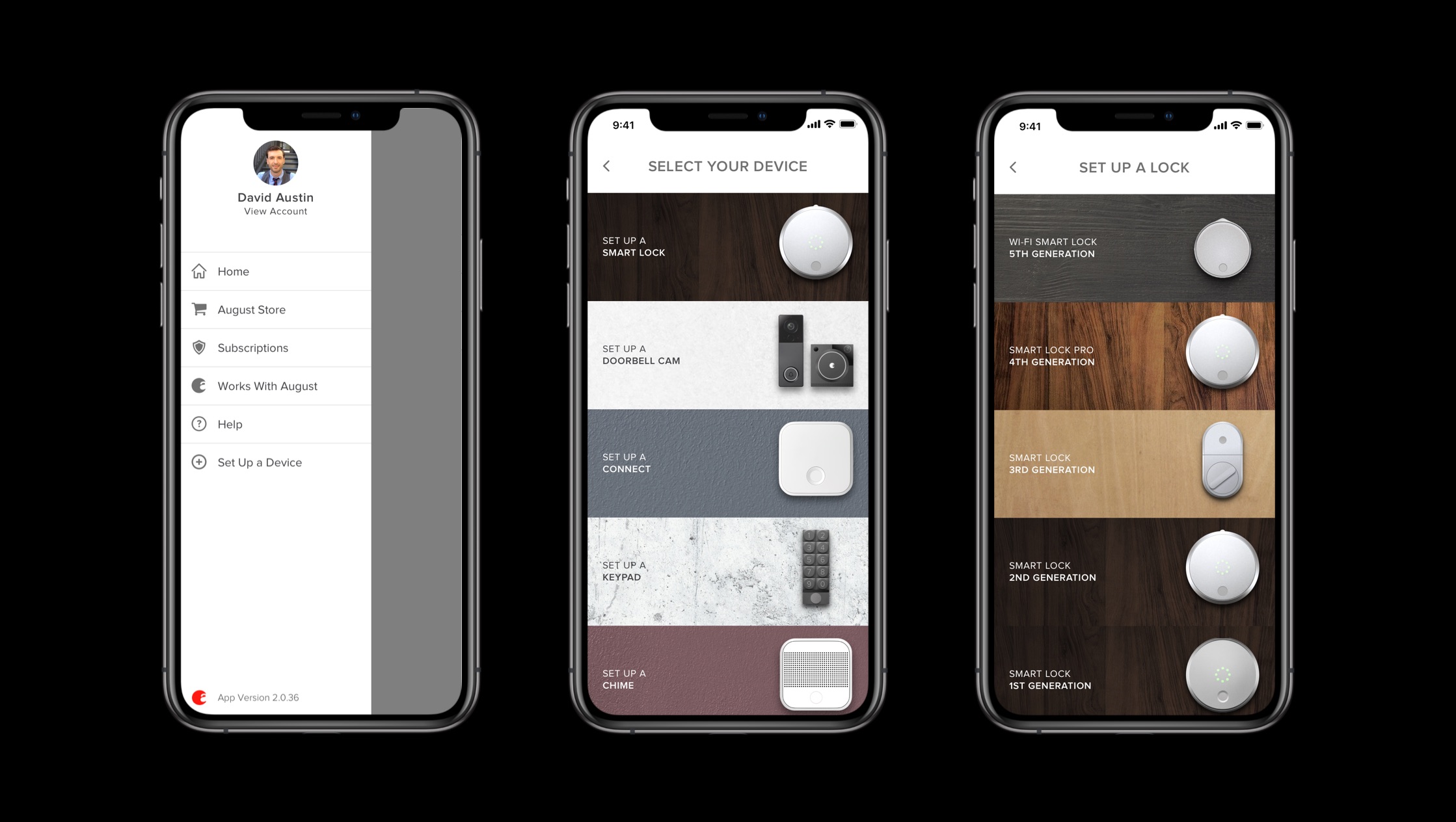
1. Users were having discoverability issues with "Connected by August" brand. It was hidden in the list of the app's device picker and didn't clearly group the products by its type, put on the side from our main August branded devices.
2. August was growing the app to be the host app to hundreds of new devices from our sister companies. The current IA and app is not scalable because the design was optimized for a small number of hardware products, making users go through a complicated device sorting design.
Solutions
With the current device picker, we have architected the app to accommodate a specific set of products, which is our own August brand. Soon enough we realize this won't be feasible with our expansion plans.

1. Use of QR codes
When we decie on QR codes, it was a relatively easy decision because of the small cost and adapatibility. Our experience with HomeKit stickers and QR codes taught us a different experience that was achieavable. Some QR codes are also modifiable with a logo graphic, which leads to potential clear brand experience.

2. Remove heavy images
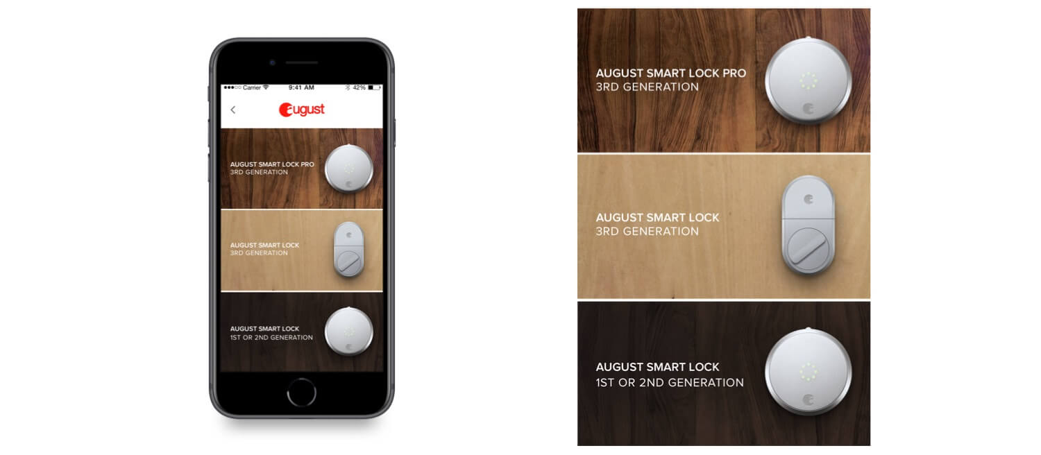
We have to retire our image libraries that was coded into the app. The heavy downloads and potential growth of the app could jeapordize the download and seamless experience. Pretty, but they also were time consuming to produce. Growing to a bigger company we can't make one for each product across multiple companies.

3. Rely on server
Instead of implementing the designs coded in the app, we now rely on our servers to provide the list of products and crosscheck their serial numbers/model number/SKU to lead to the correct setup flow.
Users
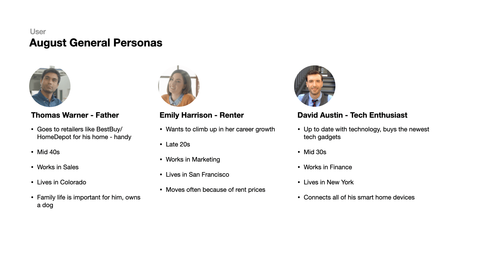
With August's users in mind, onboarding experience applies to all target users, but especially to a renter like Emily, who will need to go through this process again with her move. Onboarding is a step that reflects the most of the customer journey and experience.
How our current setup flow is distributed
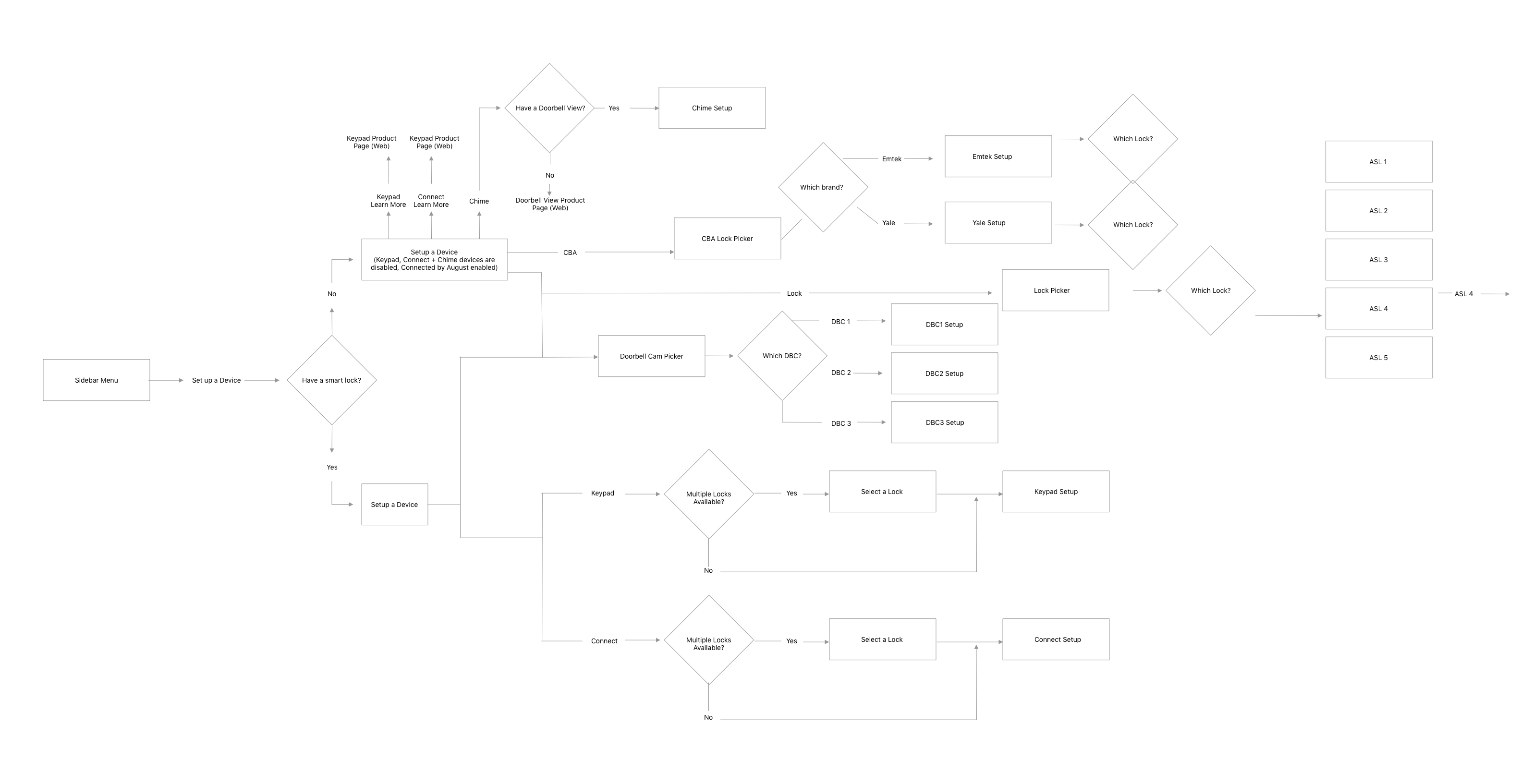
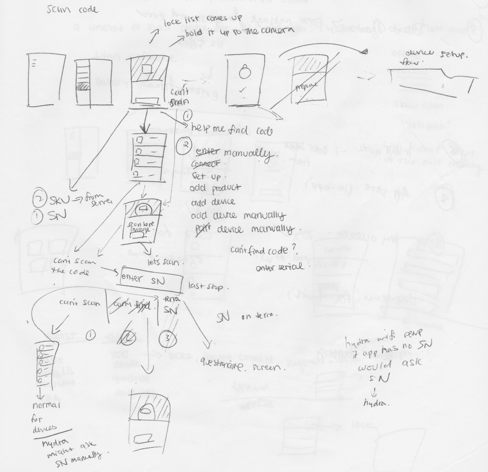
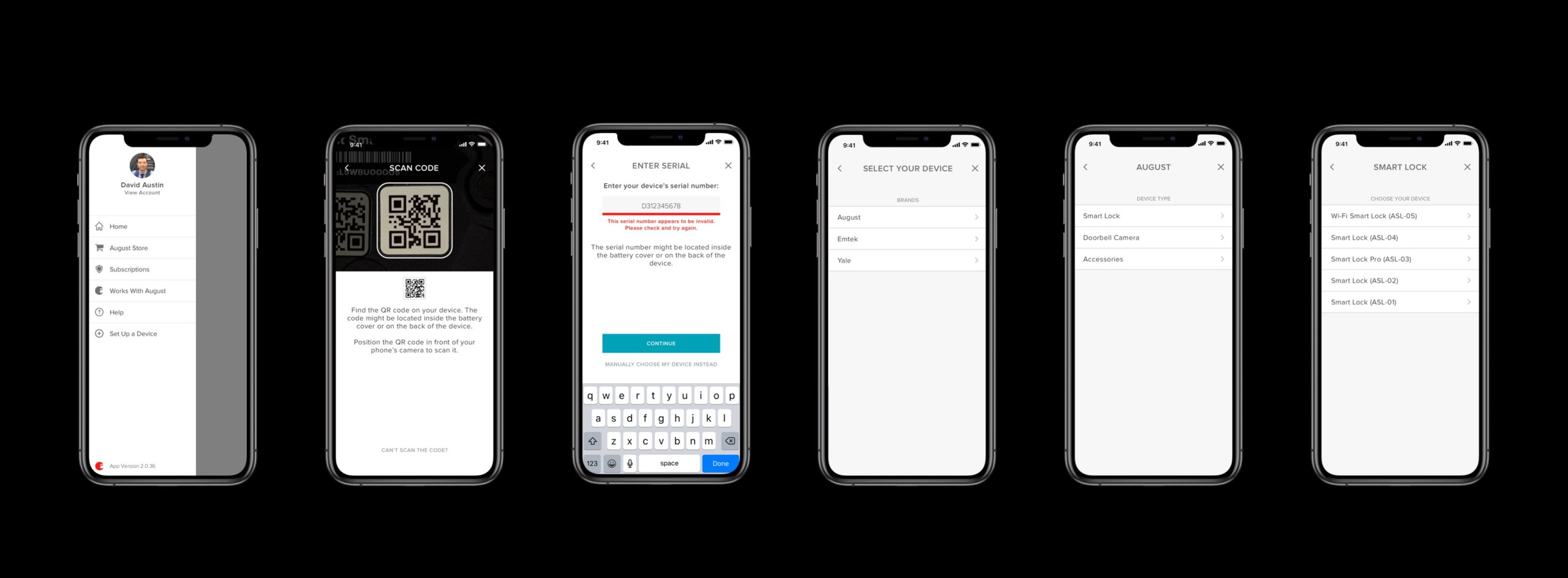
Our current flow gives the users a manual navigation towards a device setup. They would have to go through 4/5 taps and a possible 1 scroll to get there depending which device they're setting up.
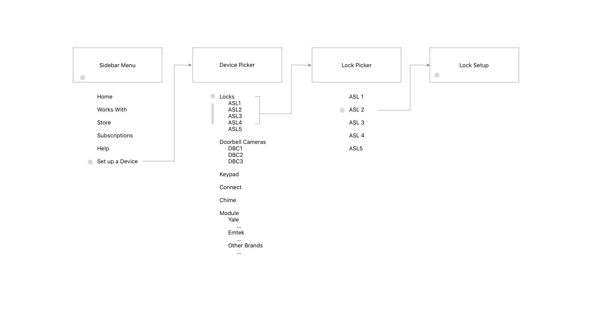
4/5 taps and a scroll, discoverability issues
As you see above, the user will need to go through the sidebar menu, set up a device, goes through the device picker with possible scroll, lock picker then proceed to the actual device setup flow. Here, the device picker is clearly architected for smaller number of products. Here we also separate our sister brands in another section under module. That list of products keep changing and to control that section compared to our brand will be very complicated.
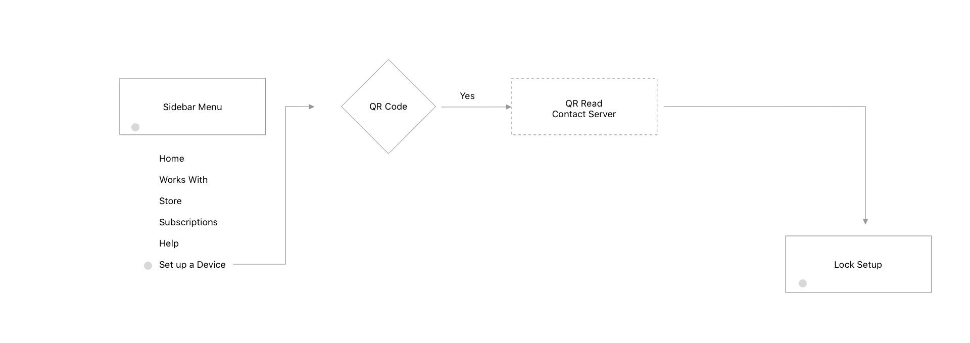
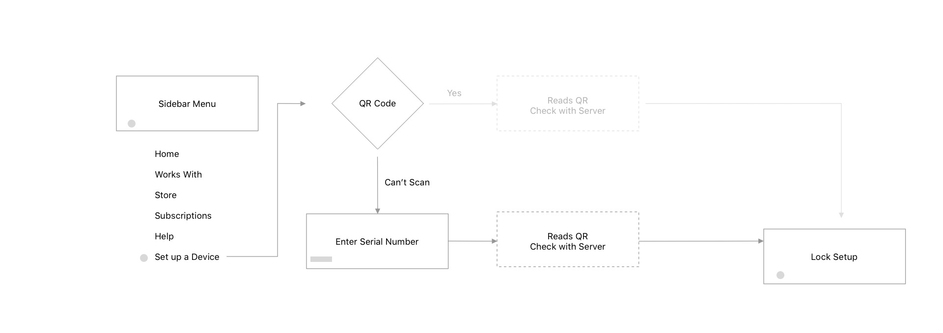
Fallback 1 still offers less taps, mindful of legacy product owners
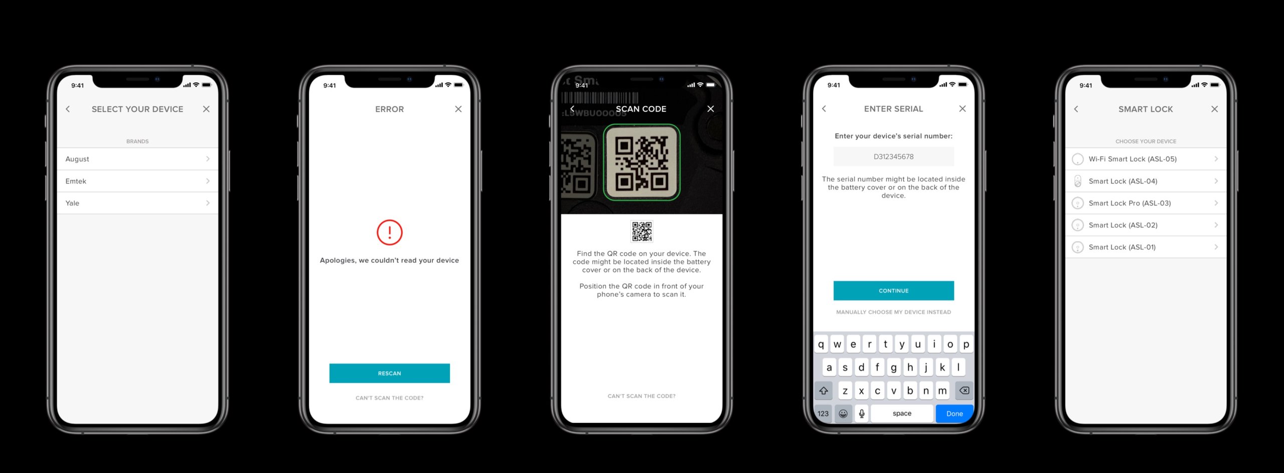
In case a qr code is not readable, no qr code is available, broken camera or an issue with the qr code, we goes to our first fall back which is the manual serial number page. Here a user types their serial number manually as any product will offer these on the device. We are also mindful to our legacy product owners who doesn't have the qr codes here.

Last fallback, utilizing a manual picker, without the heavy images and server driven
In the last fallback, we go through the absolute last method, which is similar to our current device picker, but streamlined. Here images are stripped, down to text list, categorized by brand, device, and model number. The pure skeleton version will allow us to accommodate huge product lists as this app is going to host a lot of them. The server provides the list so it's modular and easy to maintain on the company side as well.
Saving $ and time
By not using image assets and heavy loads of app data, we are projecting to save us money by not using a separate illustrator, image licenses, and renders. It also allows us to save our time by adding the product model number to the list on the backend side.
Small cost analysis
Any company decision will lead to cost, and one of them is a small add on for the production of the qr codes themselves. These stickers are relatively cheap in the BOM to manufacture and we just need to logistically align this consistent method with our sister companies.
Design

Our first pass
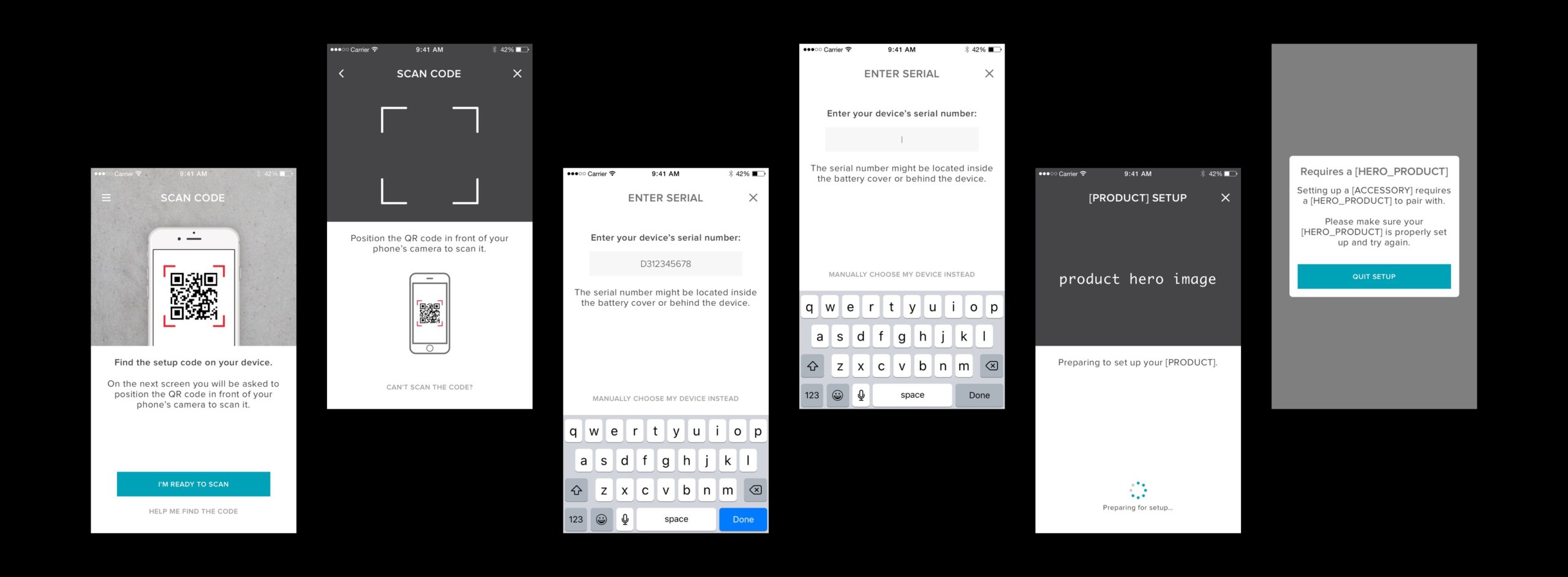
Early on we thought to introduce the idea of QR code by suggesting reading an instruction first on how to use the QR code and where to find it. This became apparent it would be redundant towards the second page to show another instruction on top of what we already learned from the previous screen.
Happy path
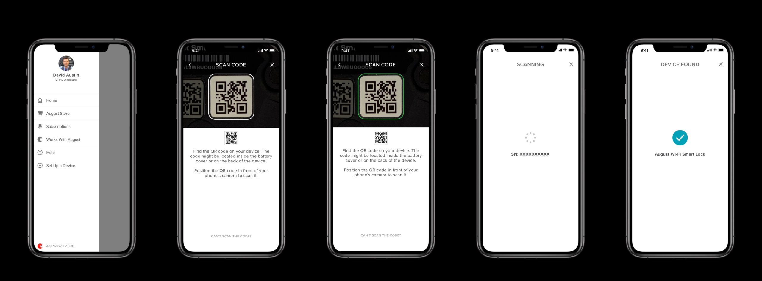
We wanted to put the instruction the QR code scanner front and center. The green squircle gives it a nice feedback when scanned.
Fallback 1 - Enter serial number manually
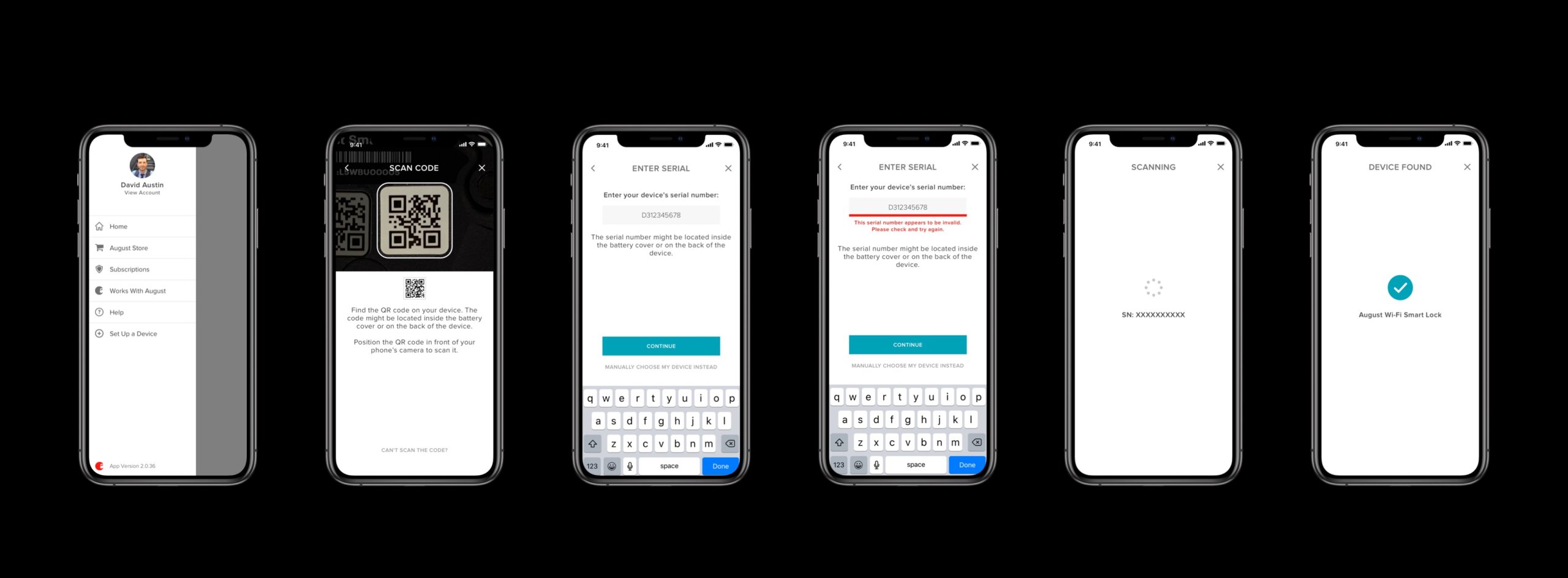
We decided to let the user manually enter their serial number manually so that we would have them enter the exact right device. Typing experience is significantly less time consuming than browsing our growing list of products.
Fallback 2 - Back to manual device picker
This latest fallback is the least desired way to set up your device, but hey it still works. Lists are now server driven and the number of products are still going to grow.
Error handling and messaging
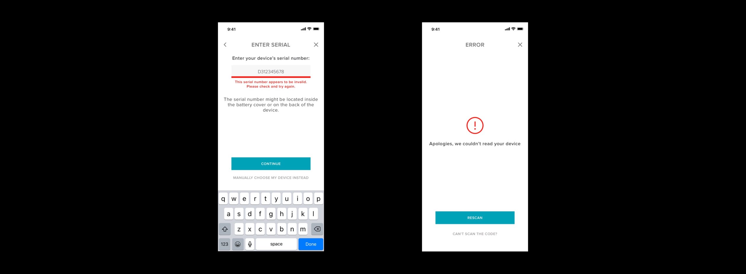
Our messaging has been updated with error handling. The words "Please" or "Apologies" are part of the strategy to make the app voice sound more friendly, inviting and yet trustworthy. Think apartment front desk.
Other previous considerations
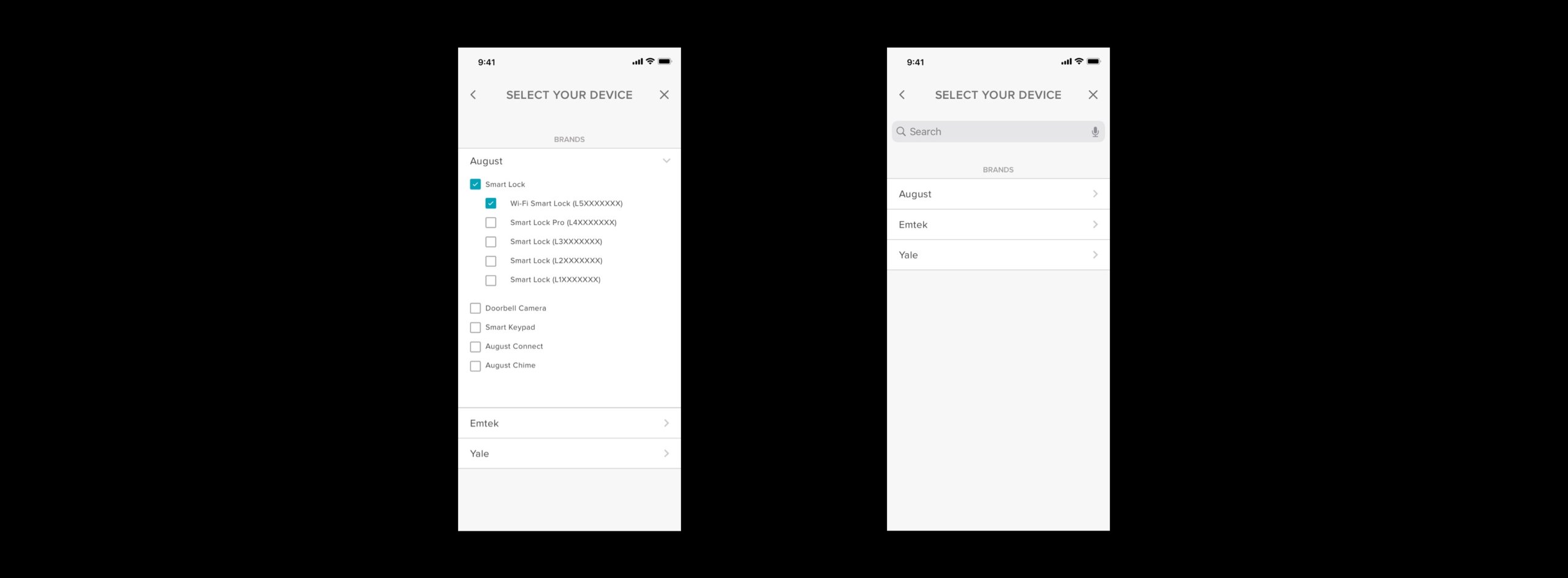
We considered having a tappable list that has less screen swipes, but as you can see the tappable areas are small, confusing and the list looks messy. Also we have considered a search bar, but populating such items might not be feasible in the time constraint we had.
Validation
?? 8MB of Space saved
?? Decrease in-app image library by 32 assets
?? No negative impact to current user flow
?? Simpler Information Architecture
Reflections
Strategizing the QR code development early on really helped our company by setting us up to be able to handle more information in the future easier. It benefits us from doing more work later in the future and less imagery to make. Furthermore, it benefits to the user as well by going through less taps and discovering different products just to setup. Our QA team saw a signficant improved experience and feedback had been positive.
This implementation is for August app and Yale Access app. If done right, it might extend to other brands. Also, by doing QR codes it might need extra item to the BOM, and potential branding on the QR code is possible.
Note: I left the company when it was still under development. Finished result may vary.
Contact
hello@kevinlessy.com
Kevin Lessy | 2025
Designed with 🩷 and ☕️